Blending creativity with code, I design websites that aren’t just functional—they look good doing it. From bold visuals to clean layouts, every project is built with purpose and a touch of personality.
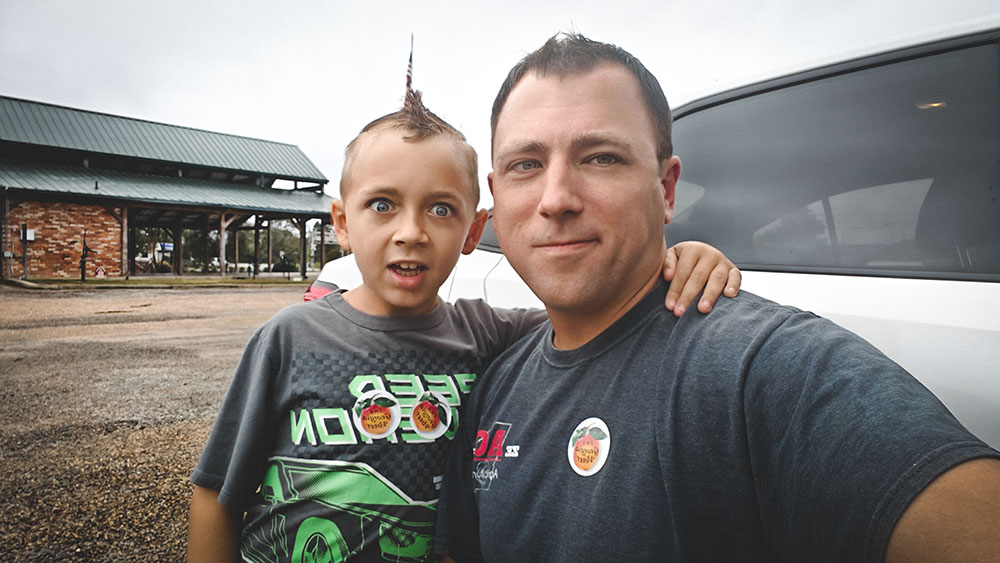
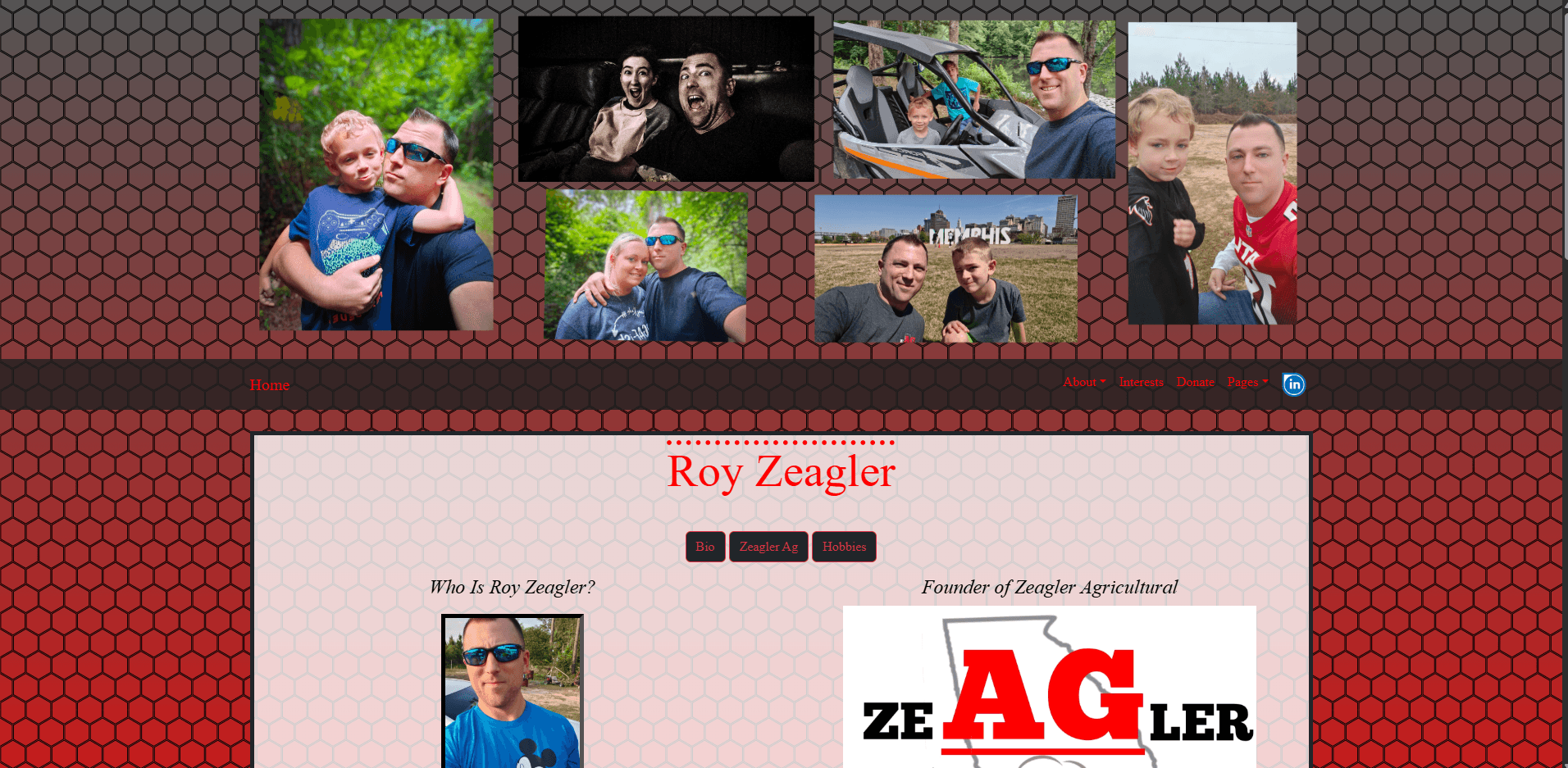
Me and my son after haircuts
I don’t just build websites—I build fast, functional, and user-friendly tools that help real people get things done. Whether it’s a clean landing page, a full-on WordPress theme, or a custom plugin that makes someone’s life easier, I approach every project like a mechanic with a socket set: hands-on, precise, and ready to get under the hood.
Everything on this site—from the layout to the backend SEO tools—was built by me. I specialize in custom WordPress development, Bootstrap-based layouts, lightweight performance, and responsive design that works just as well on a phone as it does on a widescreen monitor. This portfolio gives you a peek at what I’ve built, how I think, and why you might want to work with a one-man studio that actually listens.
Me and my son after haircuts
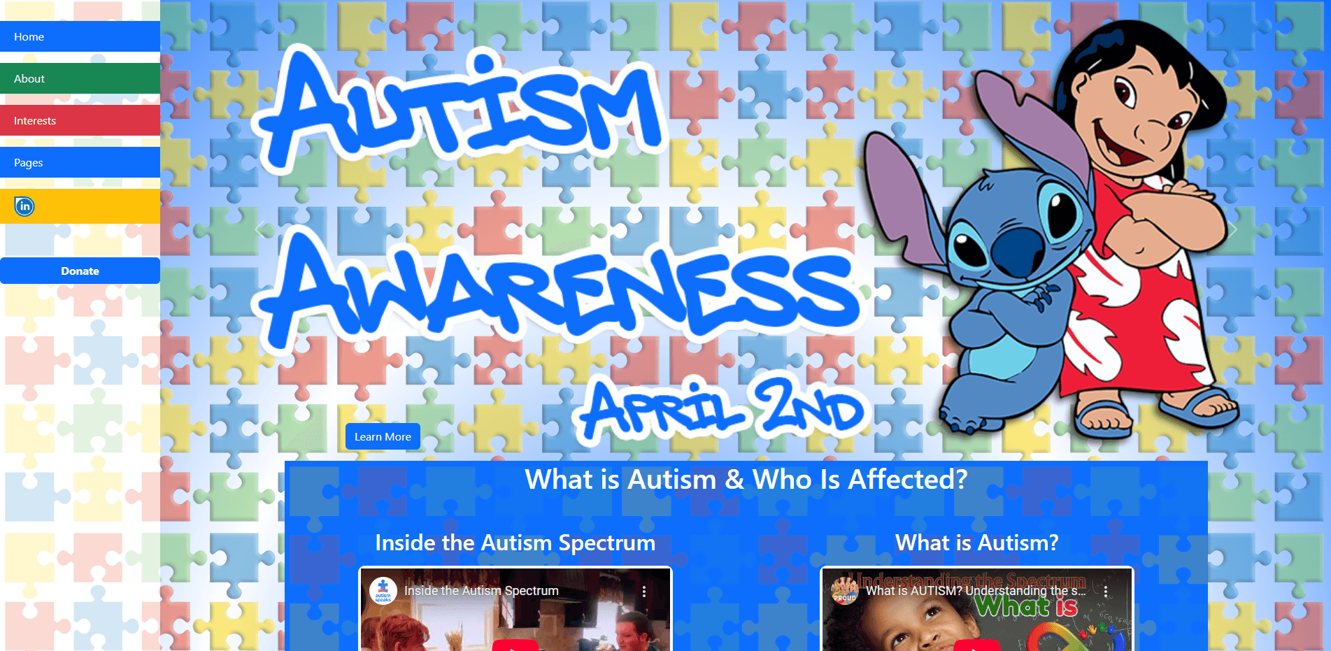
Autism Awareness
I built this Autism Awareness site as a personal passion project, because this cause hits home for me. My son is on the spectrum, and I wanted to create something bright, informative, and positive that reflects both awareness and acceptance. The site is designed to be engaging and accessible, with videos, bold visuals, and family friendly content. It’s not a commercial build, but it’s something I made from the heart, and to me, it’s one of the most meaningful things I’ve put online.
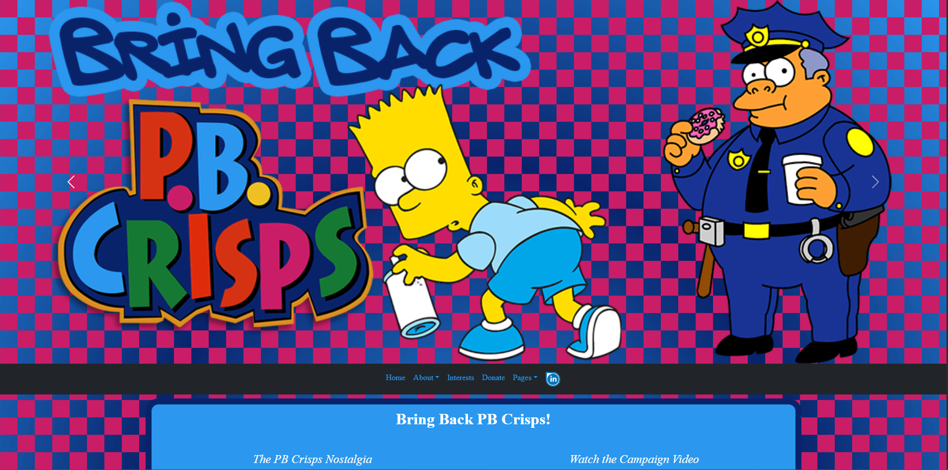
PB Crisps Tribute Site
A nostalgic tribute to one of the most tragically discontinued snacks of the ’90s, this site was built out of pure peanut-buttery passion. I designed the layout to feel like a playful blend of retro web aesthetics and modern responsiveness—complete with bright colors, product history, and fan-sourced media. It’s lighthearted, weirdly specific, and full of charm, just like the snack itself. This wasn’t a client project. It was just for fun—and sometimes, those are the best builds.
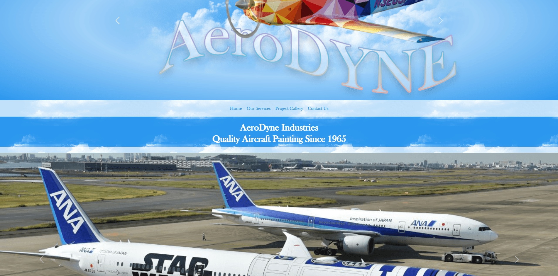
Aerodyne Aircraft Painting
This one was part of a school project—a full website concept for Aerodyne, a company that specializes in aircraft painting. The goal was to create something clean, professional, and trustworthy, while still standing out from your typical small business site. I went with a bold hero section, service-focused layout, and just enough flair to reflect the precision and artistry of their work.
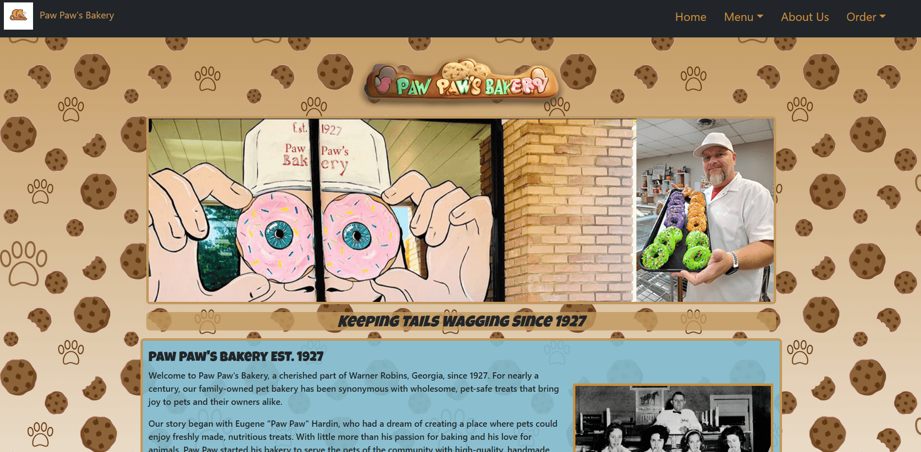
Paw Paw’s Bakery
This was another school project—this time for a fictional pet bakery called Paw Paw’s. The idea was to mix a playful tone with a vintage hometown vibe, which meant dog treats, cookie backgrounds, and warm branding all around. I leaned into fun UI elements and a friendly layout that felt like something you’d stumble across in a small-town storefront. Every part of the build—from colors to fonts—was chosen to reflect a family-owned business with heart. And yeah, those sprinkled dog donuts? They might be the star of the show.
Old Portfolio Site
This wasn’t my first site—but it was the first one I built after getting back into web development years later. It was part of a class assignment and served as my reintroduction to modern HTML, CSS, and design trends. The layout’s a little flashy, the background’s doing a lot, but it got me back into the groove. It helped me rediscover how much I enjoy building things from scratch and kicked off the portfolio you’re seeing now.
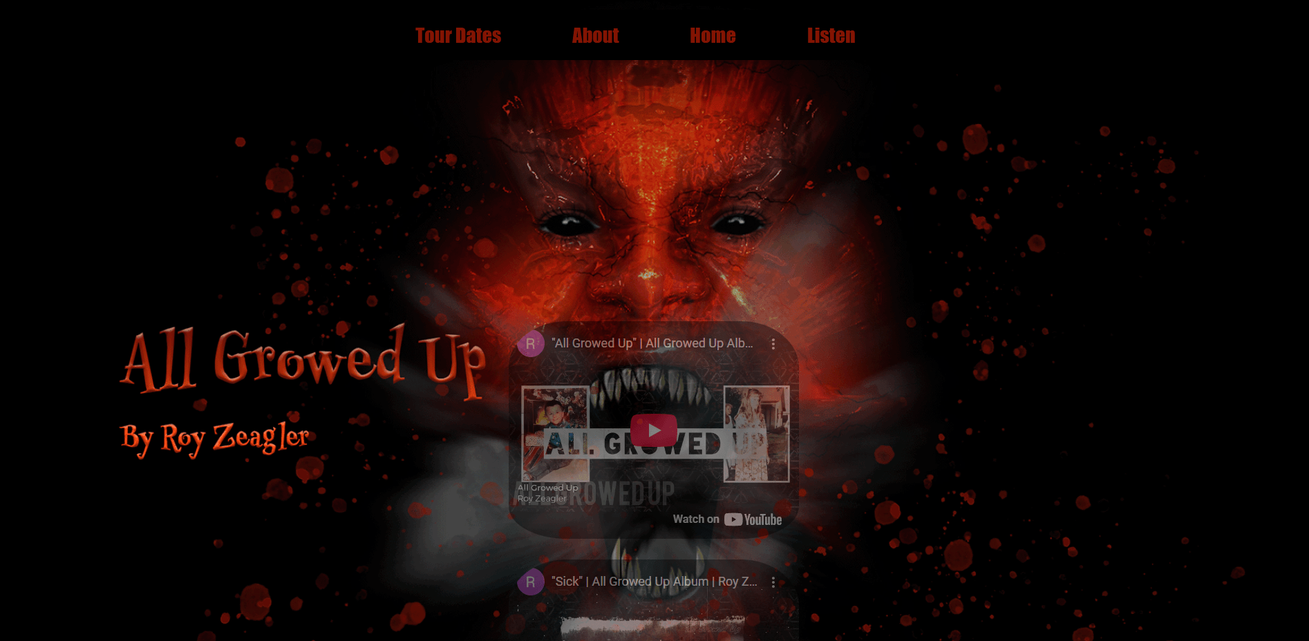
Roy Zeagler Music
Dark, loud, and unapologetically raw—this site was built to reflect the energy and edge of my album All Growed Up. I designed it with a cinematic horror-inspired theme, combining deep reds, textured overlays, and layered visual elements to match the emotional intensity of the music. The layout is simple but deliberate, directing attention to what matters most: the sound. You’ll find embedded tracks front and center, bold typography, and a no-fluff interface that leans into attitude over polish. This wasn’t about building something pretty—it was about building something real.